ScoreFluent
Describe Image gives you a chart, map or process diagram, twenty-five seconds to study it, and forty seconds to describe it. It is one of the few tasks where a human expert reviews your Content, so recited filler cannot pass as coverage.
The format. 5–6 per test · 25s prep + 40s to speak · Content, Oral Fluency and Pronunciation, with a human expert reviewing Content.
Source: PTE Academic Test Taker Score Guide (Pearson) · pearsonpte.com — retrieved Jul 2026. Not affiliated with or endorsed by any exam board.
How to use this set
Each episode below screen-records three real questions in the app, with the genuine 25-second prep and 40-second recording windows. Attempt each one out loud as the countdown runs — then come back here and open the model answer to see what full coverage looks like and which key points it hits.
These are not real exam questions. Nobody outside Pearson has those. They are ScoreFluent bank questions written to the published format — the same ones the app serves.
The episodes
Episode I
Watch episode I → · the three charts below, with the real 25-second prep and 40-second recording windows running.
Question 1 — Business
Model answer and key points
This bar chart displays quarterly sales performance across three product categories in 2023. Electronics is the strongest performer, reaching 180 thousand USD in Q4, showing significant growth throughout the year. Home Goods demonstrates steady growth from 60 to 95 thousand USD across quarters. Apparel remains relatively stable, fluctuating between 80 and 110 thousand USD. Overall, Electronics consistently outperforms the other categories, while Home Goods shows the most consistent upward trend.
Key points the answer has to cover
- Electronics is the highest-performing category, peaking at 180 thousand USD in Q4
- Home Goods shows consistent growth from Q1 (60) to Q4 (95)
- Apparel ranges between 80 and 110 thousand USD with slight fluctuation
- Electronics experiences a notable dip in Q3 (130) before recovering in Q4
- All three categories show an upward trend from Q1 to Q4
- Electronics maintains the largest sales figures across all quarters
Question 2 — engineering
Model answer and key points
This diagram illustrates the six sequential stages of municipal water purification. The process begins with coagulation, where chemicals are added to the water. This is followed by flocculation, which groups suspended particles together. The water then undergoes sedimentation to allow particles to settle. Next comes filtration to remove remaining impurities, followed by disinfection to eliminate harmful microorganisms. Finally, the purified water moves to distribution for supply to consumers. Each stage builds upon the previous one to ensure safe, clean drinking water.
Key points the answer has to cover
- The process contains six sequential stages flowing from coagulation to distribution
- Coagulation is the first step, using chemicals to prepare water
- Flocculation groups suspended particles together after coagulation
- Sedimentation allows particles to settle before filtration
- Disinfection eliminates harmful microorganisms before distribution
- Distribution is the final stage delivering purified water to consumers
Question 3 — Education
Model answer and key points
This is a schematic map of a university campus showing the layout of four main buildings and the road network connecting them. The Administration Building is located in the lower left, while the larger Science Building sits directly above it. The Library is positioned in the upper left corner, and the Arts Centre occupies the right side of the campus. Roads connect these facilities, with the main entrance at the top center and a bus stop nearby for campus access.
Key points the answer has to cover
- The campus has four main buildings: Administration, Science Building, Library, and Arts Centre
- Main entrance is located at the top center of the campus with a bus stop nearby
- The Science Building is the largest structure on campus
- The Library is positioned in the upper left area
- Roads connect all buildings, with the Arts Centre accessible from the central road network
- The Administration Building serves as a connection point between the entrance and other facilities
Episode II
Watch episode II → · the three charts below, with the real 25-second prep and 40-second recording windows running.
Question 1 — demography
Model answer and key points
This line graph illustrates world population growth from 1950 to 2050. The population has shown a consistent upward trend, starting at 2.5 billion in 1950 and reaching 7.8 billion in 2020. The most notable observation is that while growth continues, the rate of increase appears to slow down in recent decades, with projections showing the population reaching approximately 9.7 billion by 2050. Overall, this represents nearly a fourfold increase over the entire century.
Key points the answer has to cover
- World population was 2.5 billion in 1950
- Population reached 7.8 billion in 2020
- Projected population in 2050 is 9.7 billion
- Growth rate shows acceleration from 1950-1990, then deceleration from 2000 onwards
- Total increase of 7.2 billion people over 100 years (1950-2050)
- Population nearly quadrupled between 1950 and 2050
Question 2 — energy
Model answer and key points
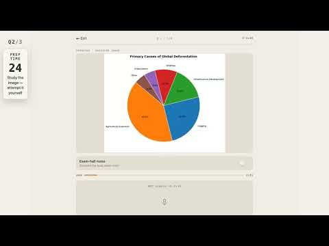
This pie chart illustrates the primary causes of global deforestation. Agricultural expansion is the dominant factor, accounting for 40% of deforestation, making it by far the leading cause. Logging represents the second-largest contributor at 25%, while infrastructure development accounts for 15%. The remaining causes—wildfires, urbanization, and other factors—collectively make up just 20% of global deforestation. Together, agricultural expansion and logging are responsible for nearly two-thirds of all deforestation worldwide.
Key points the answer has to cover
- Agricultural expansion is the largest cause at 40%
- Logging accounts for 25% of global deforestation
- Infrastructure development represents 15%
- Wildfires and urbanization each contribute 10% and 5% respectively
- Agricultural expansion and logging combined account for 65% of deforestation
Question 3 — social science
Model answer and key points
This table presents student enrollment data across four faculties in 2022, broken down by gender. Science has the highest total enrollment with 2,500 students, followed by Engineering with 2,400. Across all faculties, there are 4,950 male students and 4,200 female students, totaling 9,150 students. Male students outnumber female students overall, with the most significant male majority in Engineering where males account for 1,500 of the 2,400 enrollees.
Key points the answer has to cover
- Total student enrollment is 9,150 across four faculties
- Science has the highest enrollment at 2,500 students
- Engineering has the second-highest enrollment at 2,400 students
- 4,950 male students compared to 4,200 female students overall
- Engineering has the largest gender gap with 1,500 males versus 900 females
- Arts has the lowest total enrollment at 2,000 students
Episode III
Watch episode III → · the three charts below, with the real 25-second prep and 40-second recording windows running.
Question 1 — technology
Model answer and key points
This bar chart displays global internet users across six regions in 2023, measured in millions. Asia dominates significantly with 2,900 million users, making it the clear leader by a substantial margin. Europe follows with 750 million users, while North America has 350 million. Africa, Latin America and the Caribbean, and Oceania have considerably lower adoption rates at 600, 450, and 30 million users respectively. The data clearly shows Asia's overwhelming dominance in internet users globally.
Key points the answer has to cover
- Asia leads with 2,900 million internet users in 2023
- Europe is second with 750 million users
- North America has 350 million users
- Africa has 600 million internet users
- Latin America and Caribbean region has 450 million users
- Oceania has the lowest user count at 30 million
Question 2 — economics
Model answer and key points
This choropleth map displays global GDP per capita in 2022 across all continents, measured in USD. North America leads significantly with 60,000 USD, followed closely by Oceania at 45,000 USD and Europe at 35,000 USD. In contrast, Africa has the lowest GDP per capita at just 1,500 USD, while Asia and South America fall in the middle range at 7,500 and 10,000 USD respectively. The map clearly illustrates substantial economic disparities between developed and developing regions worldwide.
Key points the answer has to cover
- North America has the highest GDP per capita at 60,000 USD
- Oceania ranks second with 45,000 USD
- Europe has 35,000 USD GDP per capita
- Africa has the lowest value at 1,500 USD
- Asia and South America have 7,500 and 10,000 USD respectively
- Significant economic disparity exists between continents
Question 3 — biology
Model answer and key points
This diagram illustrates the process of photosynthesis, which is a fundamental biological process. Three key inputs are absorbed by chlorophyll in the chloroplasts: sunlight, carbon dioxide, and water. Through this process, chlorophyll produces glucose, which serves as an energy source for the plant, and releases oxygen as a byproduct. This shows how plants convert light energy into chemical energy while also generating the oxygen that's essential for most life on Earth.
Key points the answer has to cover
- Three inputs are absorbed by chlorophyll: sunlight (light energy), carbon dioxide (CO2), and water (H2O)
- Chlorophyll is located in chloroplasts
- Glucose (sugar) is produced as a product of photosynthesis
- Oxygen (O2) is released as a byproduct
- Sunlight provides the light energy that drives the entire process
Episode IV
Watch episode IV → · the three charts below, with the real 25-second prep and 40-second recording windows running.
Question 1 — climatology
Model answer and key points
This line graph shows the average monthly temperature trends for three cities throughout 2023. All three cities follow a similar seasonal pattern, with temperatures rising from January to July and then declining towards December. City B maintains the highest temperatures year-round, peaking at 29°C in July, while City C remains the coldest, dipping below freezing in winter months. City A falls between the two, reaching its maximum of 28°C in July. The summer months from June to August show the warmest conditions across all cities.
Key points the answer has to cover
- All three cities peak in July with City B at 29°C, City A at 28°C, and City C at 23°C
- City C experiences sub-zero temperatures in winter, dropping to -5°C in January
- City B is consistently the warmest city throughout the entire year
- Temperature ranges are widest in summer (June-August) and narrowest in winter months
- All cities show a symmetrical pattern with rising temperatures January to July, then declining July to December
Question 2 — urban planning
Model answer and key points
This is a schematic map of a university campus showing the layout of four main buildings and key facilities. The Library is positioned in the upper left, while the Science Lab occupies the lower left corner. The Lecture Hall is centrally located, and the Administration Building sits in the upper right. Two main roads intersect the campus: Main Avenue running horizontally and Campus Walk running vertically. Additional facilities include a Cafeteria near the Lecture Hall and a Bus Stop on the eastern side of the campus.
Key points the answer has to cover
- Four main buildings: Library, Science Lab, Lecture Hall, and Administration Building
- Main Avenue runs horizontally across the campus
- Campus Walk runs vertically through the center
- Library is located in the upper left area
- Science Lab is in the lower left corner
- Cafeteria and Bus Stop are marked as additional facilities
Question 3 — Marketing
Model answer and key points
This pie chart illustrates the distribution of website traffic sources for the third quarter of 2023. Organic search dominates the traffic, accounting for 40 percent of all visitors, making it by far the largest source. Direct traffic comes second at 25 percent, followed by referral traffic at 15 percent. Social media and paid ads contribute smaller portions, representing 12 and 8 percent respectively. Overall, organic and direct channels together comprise nearly two-thirds of the website's traffic.
Key points the answer has to cover
- Organic search is the largest traffic source at 40%
- Direct traffic accounts for 25% of total traffic
- Referral traffic represents 15% of website visitors
- Social media contributes 12% of traffic
- Paid ads generate the smallest share at 8%
- Organic and direct combined make up 65% of total traffic
Episode V
Watch episode V → · the three charts below, with the real 25-second prep and 40-second recording windows running.
Question 1 — research
Model answer and key points
This table compares four research projects across several dimensions including funding, duration, and outcomes. Pharmaceutical Research received the highest funding at 700,000 dollars and the longest duration of 36 months with 10 researchers, resulting in a new drug compound. In contrast, Climate Modeling had the lowest funding at 300,000 dollars with the shortest timeframe of 18 months. The remaining projects—AI in Healthcare and Educational Technology—fall in between, with moderate funding levels ranging from 400,000 to 500,000 dollars. Overall, there's a general correlation between higher funding and longer project duration, though the number of researchers varies independently.
Key points the answer has to cover
- Pharmaceutical Research has the highest funding at $700,000
- Climate Modeling has the lowest funding at $300,000
- Pharmaceutical Research has the longest duration at 36 months
- Pharmaceutical Research employed 10 researchers, the most of all projects
- AI in Healthcare received $500,000 funding with 24-month duration
- Educational Technology had the shortest duration at 12 months despite $400,000 funding
Question 2 — environment
Model answer and key points
This diagram illustrates the global carbon cycle, showing how carbon dioxide moves between the atmosphere, plants, animals, soil, oceans, and fossil fuels. Plants absorb CO2 from the atmosphere through photosynthesis, while both plants and animals release it back through respiration. When organisms die, their organic matter enters the soil and decomposes, returning carbon to the atmosphere. Over long periods, organic matter in soil transforms into fossil fuels, which release CO2 when burned. The oceans also play a crucial role, dissolving and exchanging CO2 with the atmosphere, creating a continuous cycling process.
Key points the answer has to cover
- Plants absorb atmospheric CO2 through photosynthesis
- Both plants and animals release CO2 back to atmosphere via respiration
- Dead organisms and waste material enter the soil
- Soil undergoes decomposition, releasing CO2 to the atmosphere
- Long-term sedimentation converts soil organic matter into fossil fuels
- Fossil fuel combustion releases CO2 to the atmosphere, and oceans exchange CO2 through dissolution and release
Question 3 — environment
Model answer and key points
This choropleth map displays forest cover as a percentage of land area across five countries in 2022. Sweden leads significantly with 69% forest coverage, followed by Brazil at 59% and Russia at 50%. Canada has 39% forest cover, while Australia has the lowest proportion at just 17%. The data reveals considerable variation in forest coverage among these nations, with Nordic and South American countries maintaining substantially higher forest coverage than Australia.
Key points the answer has to cover
- Sweden has the highest forest cover at 69% of land area
- Brazil has 59% forest coverage
- Russia's forest cover is 50% of its land area
- Canada has 39% forest coverage
- Australia has the lowest forest cover at 17%
- Data represents 2022 figures across five countries
Attempt these with real scoring
A model answer shows you what a good answer looks like. It does not show where your answer lost marks. For that, record yourself and get a score. All of these questions are on ScoreFluent with the real timings. Your speaking score opens as soon as you stop recording. You also get word-level pronunciation feedback (which word, which sound) and AI tutor Flo on every result. Describe Image gets Personalised Tips (8 credits), and new accounts get 40 free credits. Start with 40 free credits →
Practise Describe Image with instant scoring →
More on the strategy behind this task: do PTE templates still work in 2026?.
Watch these worked through
Each one is answered in the real app with the actual countdowns running, so you can attempt the questions in real time alongside the video.